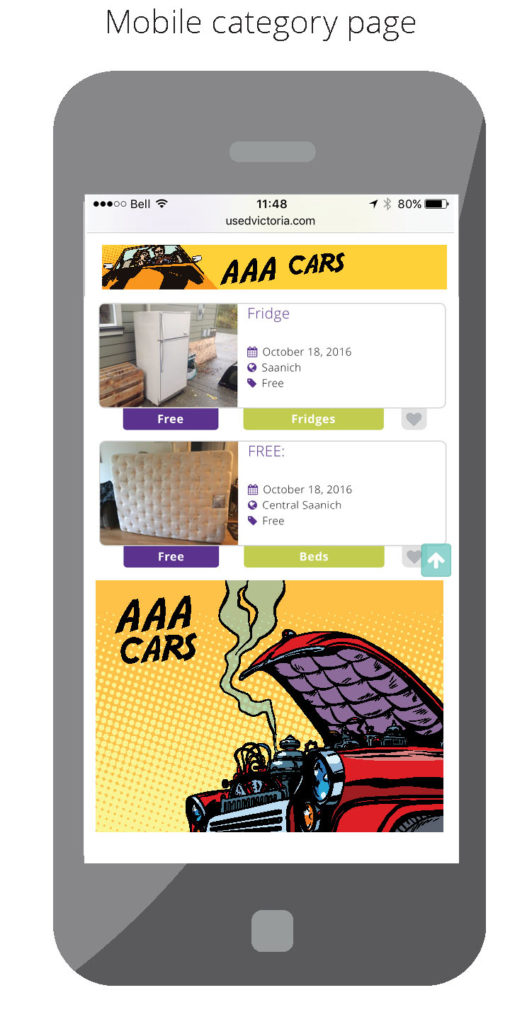
Display advertising
Put your marketing campaign into overdrive and reach thousands of local auto shoppers daily. 
80% of car buyers make their purchase decision through  online research*
- Ads run in targeted categories to reach qualified, local auto shoppers
- Sell your pre-owned inventory
- Highlight events and limited time offers
- Harness the power of movement with animated ads
- Creative services are included at no additional cost**
- Keep your campaigns fresh with free updates
Our CPM rates (cost per thousand impressions) provide dealers with tremendous value in reaching your target audience.
Think of Used.ca the next time you have a weekend sale or celebrate a milestone at your dealership. Weekly and monthly pricing available.
Learn more about affordable digital display advertising with Used.ca by contacting us today.

or
Call us for more information: 1-888-480-3250, ext 3298
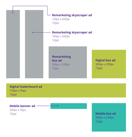
Display ad sizes and specs

*Accenture
**Minimum campaign required